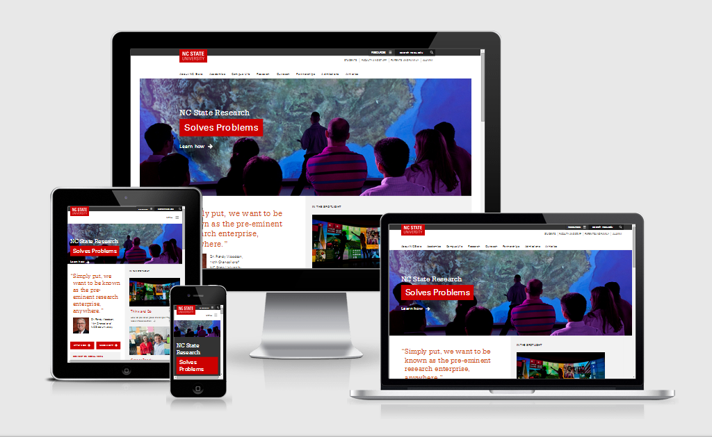
Several institutions have launched a redesigned responsive website over the past few weeks as I noted in my previous post: Redesigned & Responsive for Back-to-School: 6 new #highered websites.
 Since I know you are always interested in finding out about what goes into these big projects, I decided to ask a few questions to Luis Chacon, Director of Web Communications at North Carolina State University where the redesign is part of a rebranding.
1) What were the strategic goals for this redesign?
Our overall goal was to create an innovative, purposeful web experience that reflects the university and its new brand. In our approach to digital content strategy, design and development, we focused on getting our users to the information they need and letting that information speak for itself.
We’re in the very early phases of our first major rebranding campaign in 17 years and we wanted the new central website to radiate our new brand and project our “Think and Do†culture.
Some of the measurable goals of the new homepage are to drive traffic to the admissions section, where future undergraduate and graduate students can apply to NC State, and to increase site visits to the university’s Giving website. Our topical pages are built to increase awareness of our world-leading faculty, our cutting-edge, solution-driven research, our extensive industry and government partnerships, and our commitment to leading in experiential education.
2) Your new homepage looks definitely better on a smartphone display than on a desktop. How did you tackle this mobile-first responsive redesign?
We like to think that our homepage looks great and shows off our new brand on all devices and screens. We definitely took on the ‘mobile-first’ mantle when we started planning the redesign. We took a little less than a year to work on it, using our new brand platform as the foundation for our approach.
 We started with several brainstorm sessions to help define and refine our overall strategy. We did a full site inventory, analyzed analytics and rebuilt our information architecture. We had conducted several usability tests during the year and had started making small iterative updates while we planned for the major facelift. Our old website (the product of those iterative changes) won a second consecutive CASE regional grand award last year, and that award gave us a sense that our strategy was sound.
We then focused on content strategy and projecting our new brand platform through all of our landing pages. We created page content templates, identifying specific page goals and mapping content on our topical landing pages to align with our brand drivers.
As part of our team focused on content mapping and execution, we transitioned into design and development. Having a bulk of our content underway, we selected Twitter’s Bootstrap as our front-end foundation. We decided to create an NC State flavor for our bootstrap, removing gradients/drop shadows and squaring off all rounded corners. NC State is a place of hard edges and right angles, and we utilized flat design principles to mirror that aspect of the campus and the brand.
3) The recent redesign of Bucknell University has been criticized by usability experts for breaking conventions AND rules. How did you make sure that your redesigned website would make usability a priority?
We weren’t opposed to being courageous with our redesign, knowing that we needed to deliver a new, bold and innovative experience via our primary communication channel.
We spent an equal amount of time on strategy as we did on content, design and development. We conducted focus group and usability tests before and during the redesign, and we have plans to continue testing after the site launch. We benchmark our approach to digital communications against industry-leading websites, not just higher ed. We feel comfortable introducing new concepts to our community, not always common in academia, but we also believe in analyzing metrics and planning on continuing to make iterative changes to our website based on data, testing and even anecdotal feedback.
4) Ultimately what is going to be your measurement strategy for this redesign? What KPIs did you select to measure its success?
The measurement strategy for the redesign is tied directly to our rebranding efforts. We have a series of surveys, focus groups and info sessions planned this year to help gather metrics and sentiment on the new brand. We plan to use some of this info to help inform our organic, living brand and make iterative changes to it. This isn’t a 1-3 year brand campaign. It’s a longer-term strategy and we’ve designed it to grow and evolve with our marketing and communication needs.
The new redesign is the most visible example of how our digital-first, content-strategy approach demonstrates the essence of NC State. We’re reinforcing NC State’s clean, unembellished modern brand through all aspects of the new central site: content, design and user experience. Another aspect of our brand strategy was to guide our partners across campus to implement our new brand into their communications and marketing efforts.

We also made it easier for our campus partners to share central content on their own sites and social channels. That meets a pair of needs, broadcasting useful, on-brand content more widely and helping to fill some of the content gaps that exist on sites owned by colleges, departments and other NC State units.
We’re also developing new metrics to measure how successfully the new site supports NC State’s strategic goals: increasing partnerships, growing our international and graduate student populations, and raising academic standards among our undergrads. To that end, we’re working with campus partners to develop metrics that cover the handoff from our central presence to sites and tools where those business actions (applications, new partnerships, etc.) take place.
As with all redesigns, we have certain metrics we’re shooting for, increasing traffic to applications and fundraising chief among them. Through our enterprise-level content, we want to encourage and persuade businesses, industry, government, alumni and donors to partner and support NC State. Improving bounce rate, increasing engagement and many others traditional web metrics are all in place but for us, these and other website goals are tied into our overall brand strategy. We’ll measure our success on how much we increase our market penetration and how effectively we demonstrate NC State’s status as the pre-eminent research enterprise.


Some key insights on how NC State redesigned their website: http://t.co/gFF6cn9oeK #highered #webdesign
RT @karinejoly: Behind the Scenes of #highered Responsive Redesigns: @NCState – thks @lrchacon for answering my questions. #heweb14 http:/…
RT @karinejoly: Behind the Scenes of #highered Responsive Redesigns: @NCState – thks @lrchacon for answering my questions. #heweb14 http:/…
RT @karinejoly: Behind the Scenes of #highered Responsive Redesigns: @NCState – thks @lrchacon for answering my questions. #heweb14 http:/…
Behind the Scenes of #highered Responsive Redesigns: @NCState – thks @lrchacon for answering my questions. #heweb14 http://t.co/4UTAZtHtrH
Being courageous w/web design to get usability. @NCState new responsive website. via @karinejoly http://t.co/x2XWlcK1x6 #hesm
Behind the Scenes of #highered Responsive Redesigns: NC State | http://t.co/tos1K3SsY0 http://t.co/DMljFcAtGs
RT @fredimodules: Behind the Scenes of #highered Responsive Redesigns: NC State | http://t.co/tos1K3SsY0 http://t.co/DMljFcAtGs