While others were having some good April’s Fool fun with their homepage, the University of Notre Dame quietly launched a revolutionary homepage yesterday afternoon.
This could well be the Holy Grail of higher ed website design: a web design based on the mobile first approach that serves content on any devices using a combo of responsive web design techniques and server side detection to reduce the load for mobile (as the concept was explained by Dave Olsen a few weeks ago).
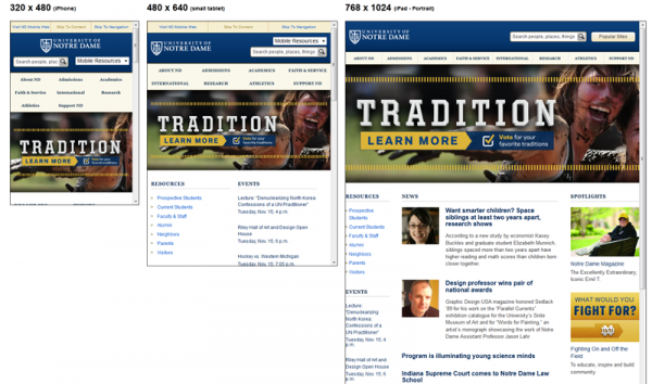
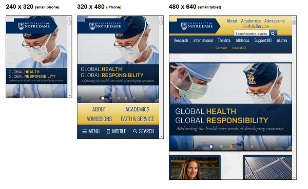
Here’s a quick look at the before and after screenshots on different widths:
BEFORE

AFTER

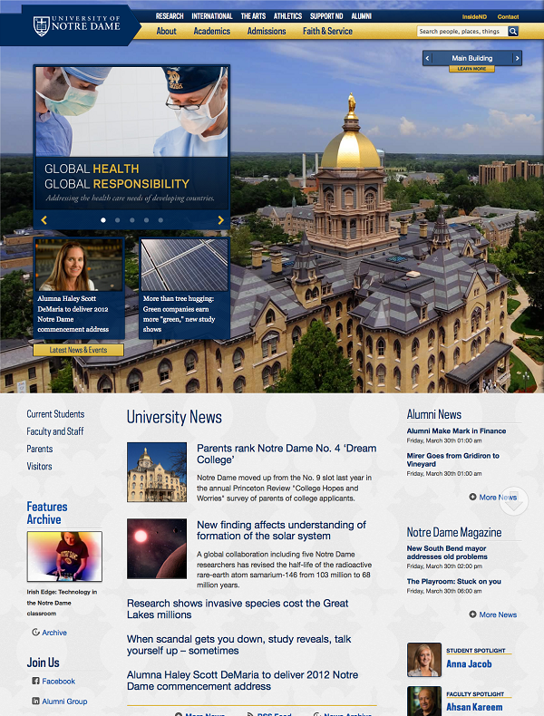
And, here’s a screenshot of the desktop version:
Make sure you go play a bit with the page – it is VERY playfull and so easy to use (I can’t wait for Nick DeNardis to review it on EDUCheckup)
That’s truly beautiful work in my book. Congratulations to Erik Runyon and the rest of the team!
What do YOU think? Anybody else in higher ed who has followed the mobile first approach yet?
 4-week online course: Mobile & Responsive Web Design for Higher Ed
(asynchronous with weekly lessons and assignments)


[…] were we successful? – you’ll have to tell me but some good sources like Karine at Collegewebeditor.com think […]
Beautiful.
Had SO much fun playing with it on my desktop.
But, I was shocked when I visited nd.edu on my smartphone, and it automatically redirected me to the m.nd.edu app.
Why would you default there now that this responsive option exists?
Eric,
Great question and one we’re discussing. The mobile site predates our responsive site, and there are varied viewpoints on whether or not to redirect anymore. I’m hoping to come to a solid conclusion soon, which may in fact result in the redirect disappearing.
Interesting but seems like a scrolling nightmare
Whilst visually and technically very good, I wonder how useful it is. Who are the key user groups and what are their tasks that this ‘responsive’ homepage supports in a better way than a more traditional layout and design? What kind of KPIs and user testing results will you be using to measure the true success of the design? I am not actually asking for answers here, but in ‘playing’ with the site, I can’t help but wonder why my entire screen is taken up with picture of a building, and what purpose it serves for end users…
x2 on what Shane said. What is the reasoning behind going that tall from top to bottom on a homepage? I’m glad that they added the tabs on the Traditions page, but it just feels like a workaround for the scrolling issue.
That being said, I have to hand it to ND on gorgeous photography and great content. Good work there!
Shane and Eric S.,
While we do recognize that initially some folks may be prone to scroll when they come to the homepage, we also expect them to hit the links in the top navigation. The primary links of the top navigation, found in the gold bar, take the user to that section of the homepage. However, once you are on a deeper subpage of the main site, clicking the a primary navigation link will take you to a page instead of a section of the homepage.
Scrolling is a learned behavior, but also a choice. We’ve given tools to help those wanting to explore the homepage, but at the same time we are not hindering those looking for specific content.
Hope that helps explain our approach. It is a feature we will be monitoring though.
Shane/Eric…thanks for the comments. We liked long form for a couple of reasons…our core audiences are rather comfortable with it…it works very nicely on a tablet…and it ups the opportunity to “play” with the site that our peripheral audience groups undoubtably want.
We felt that we provided a traditional navigational approach for those that prefer it (sticky nav anchored to the homepage sections, giving a true subpage feel) while adding another dimension that people in our test groups found very pleasing.
Not to mention, I thoroughly enjoyed challenging the responsive chops of my developer, Erik Runyon. :)
Thanks again for the comments.
Nick Johnson
Director of Web and Interactive Marketing
Phil,
It is not just the scrolling Ihave issues with. I have been in the Biz for more than 15 years and although this may be the answer for some sites it is definitley not the answer for all and I suspect once you get your user feedback you will see the same issues I am about to list:
1) people hate scrolling. And even if you bookmark at the top and bring the user down you still have to scroll back to the top.
2) Mobile users do not need ful fledge sites.
Mobiel sites are about speed and reference. Getting info on a few basic items. Loading an entire site on mobile is a waste of time and bandwitdh. You need only supply the mobile user with specific content, not the full content. Also, the downloading of all of the scripts and page information would take forever.
3) Some systems still don’t handle media queries.
I am by no means against RWD. I will definitely keep my eye on the technology and if users embrace it I will definitley be offering it. But this is one time I do not want to be first to market wit a new concept. But I am sure Notre Dame has deep pockets and can quickly switch back if need be.
Regards,
Shane
Shane,
I’m going to have to disagree with you on item 2. Mobile users want access to the same content as desktop users. Just because they’re on a “mobile” device, doesn’t mean we can assume to know their context. See Luke Wroblewski’s notes from a talk Josh Clark gave back in February (http://www.lukew.com/ff/entry.asp?1500). But I do agree that we need to keep mobile users in mind when building responsive sites. If you visit ND.edu on a mobile device, you do NOT get the full content that tablet/desktop visitors do, but the content is available through the top-level navigation. The initial download for a smartphone visitor is only 500kb, and will hopefully be less soon. That’s actually quite small for a university homepage.
On item 3, I agree not all devices support media queries. That’s why we developed the site in a way that devices that don’t support them will still get a nice experience. The media queries are there to enhance the experience for tablet and larger devices.
Please let me know if I misinterpreted any of your points.
And I’ll field #1. Wayne State just implemented a “non-scroll” return to top option to solve that exact issue.
http://blogs.wayne.edu/web/2012/03/16/a-better-return-to-top-experience/
[…] That’s why I decided to invite her to be the keynote speaker of our upcoming Higher Ed Responsive Web Design Summit, scheduled online on June 19, 20 & 21, 2012. This 3-webinar series will also feature Stewart Foss who has been teaching Higher Ed Experts’ 4-week online course on responsive web design and Nick Johnson, Director of Web and Interactive Marketing at The University of Notre Dame who oversaw the latest redesign of nd.edu. […]
[…] on April 1st – best April’s fool ever I guess too ;0) – and went so far as to call it the Holy Grail of higher ed website in my post back […]