Champions of web standards and accessibility beware: today’s post may cause heart burnt, high blood pressure, insomnia and other side effects.
Ohio University has just unveiled the new design of its website homepage. And, as you can see below, this design relies heavily on graphics to replicate… a student’s desk.
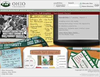
As reported by Nick Claussen in The Athens NEWS, Leonard Raley, OU’s vice president for university advancement explained that, “the idea behind the new home page is to make it look like the top of a student’s desk (…) It includes all of the information found on the current OU front door, but is presented much differently. The new front door has items such as Post-It notes, an iPod-like device, hand-written notes, photos and other items.“
The homepage also provides a link to a text-based homepage, which is a good thing as the new graphic-based design performs really poorly at the section 508 and W3C compliance tests.
On a marketing point of view, this a very interesting move toward an admission-centric website homepage.
However, I’m not sure how the other target audiences (current students, alums, faculty, staff, donors, etc.) will feel/react about their website being taken over by messy (not the cleanest desk, ever) high school seniors.


[…] People don’t like change, especially on “THEIR” homepage. The new furniture-inspired metaphorical redesign of the Ohio University’s website caught my attention last week. […]
That homepage looks like an early design from before the web matured. I can’t stand site designs based on metaphors. So sad to see a major university take a step back in site design and information architecture. Even worse, as a direct result of the design they are forced to have a separate text-only version. Today good site design is one that is forward compatible and has a single design that works across all end-user environments. In a time when college and university sites should be moving towards segmentation and personalization Ohio launches a site that potentially only appeals to one of their many user-segments. Last, the design does very little to create a digital identity and online brand for the university. What a let down!