Today, I’m celebrating the second “birthday” of this blog launched on February 12, 2005 as well as its 300th post. When I started this blog, I didn’t have a clue where this will lead me – if anywhere.
Now with more than 150 subscribers to the email newsletter, about 250 readers via RSS and over 6,000 unique Web visitors per month, I can confirm it’s been a very rewarding experience.
Two years ago, I didn’t spend a lot of time on the design of this blog — which I’m sure my fellow higher Web professionals can guess easily. It wasn’t a big deal because most readers were reading posts in RSS readers anyway.
Today, it’s time for the old design to retire.
The new WP theme I customized for the new design is called MistyLook and was created by the previous theme’s author: Sadish Balasubramanian.
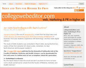
Beyond this cosmetic change, I’m also launching a few new features:
- a page listing a selection of the best higher ed bloggers
- an easy access to Higher Ed TV showcasing the best news and promotional videos produced by institutions
- an Amazon bookstore with a few good books (my attempt to get via 4%-commissions some money to cover the hosting bills)
- an “About” page (if you want to find out more about this college web editor)
Thanks again for reading!
I would love to hear what you think about the design, so let me know by posting a comment.
If you haven’t posted a comment yet, don’t be shy!


Nice work on the redesign. I especially appreciate the “higher ed bloggers” tab. (I’d appreciate it even if my blog weren’t listed — but I appreciate it even more because it is.) :)
Looks great! Really quite an improvement while still keeping the core look and feel.
Congrats on the birthday. I have read this site for about a year now and love it. I am a fan of the redesign. I like the new sections. I like the page for all the highered bloggers, think it will be helpful.
Well done Karine. Looks great. Keep up the good work, I look forward to a few more years of your writing!
Happy 2nd Birthday Collegewebeditor!! Once again, thank you for your efforts!
Great design, Karine. I’m glad you kept the overall design colors and love the new navigation tabs and sidebar.
Your book pages look particularly interesting and good to see them highlighted. And, the emphasis on higher ed TV is great.
Thanks for the link, too. I’d still refer people to your site, regardless, but … as Andrew wrote, much appreciated. I’m not afraid to admit that there are cherished links out there, ya’ know. Your’s is definitely one of them. :)
Take care.
Thanks for your nice comments, Andrew, Morgan, Matt, Georg, Shane and Robert!
Geez, if only I could get THIS kind of feedback when I get a haircut for MY birthday…. ;-)
Like the redesign, but…
The homepage isn’t formatting correctly for me. All the content that is supposed to be on the right (About, Latest Posts, Categories) is at the bottom of the page in one long, skinny column. Works fine if I actually click on any of the individual posting pages, but not the homepage.
Also, the archives don’t seem to be functioning properly. When I click on “Next” to get to the next page of postings in a particular category or month I get:
“Ooops…Where did you get such a link ?
Server cannot locate what you are looking for !
The Server tried all of its options before returning this page to you.
You are looking for something that is not here. Please try searching or browsing the archives.
Posted as Not Found”
Thanks, Colin for pointing this out (that’s more the kind of feedback I get when I get a haircut ;-)
I’ve fixed the issue with the categories and I’m working on the archives. However, I can’t replicate the problem with the homepage and the sidebar.
Can you tell me what browser you use? You’re on a Mac, aren’t you?
IE6 on a PC. Having the same issue on both the work and home computers. Not a big deal really, but not as pretty as the proper format.