Facebook unlocked the Timeline format for Pages only a week ago. As usual with changes on Facebook, the higher ed community has been very quick at adopting the new feature.
I was curious to see what some of the early adopters in higher education had done with this long-expected new format (when it was released for Facebook profiles, many wished it for their Pages).
It’s available as a preview to every Page Admin for now, so the switch is still optional. However, it will be rolled out to all Facebook Pages on March 30, 2012.
So, I did a bit of totally unscientific research by checking some of the pages listed in the 2011 State of the Facebook Pages in higher ed. I also asked over Twitter followers who made the switch to share the address of their Facebook page.
[blackbirdpie url=”https://twitter.com/#!/karinejoly/status/177071745239494657″]
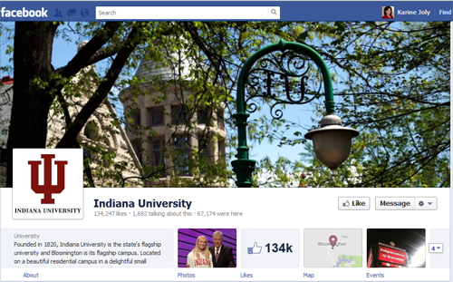
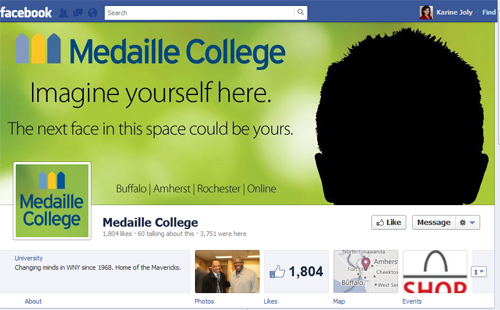
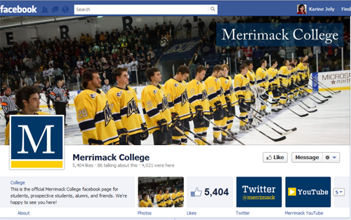
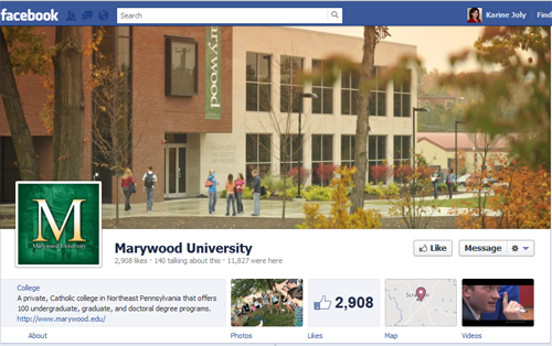
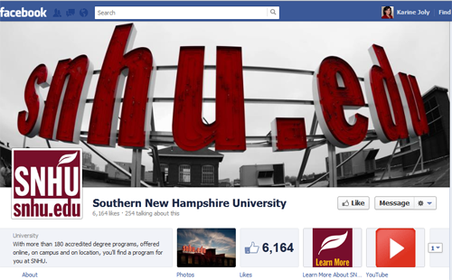
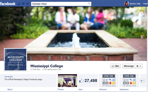
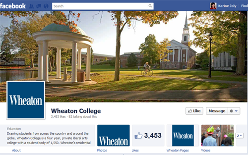
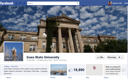
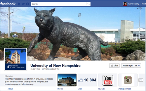
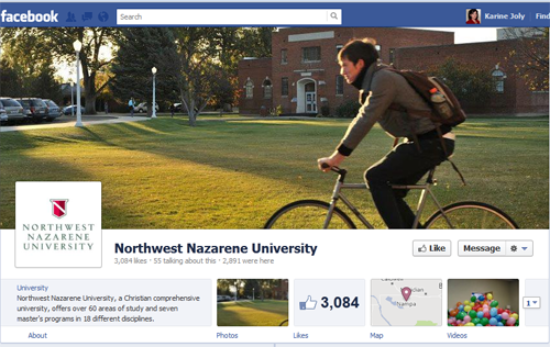
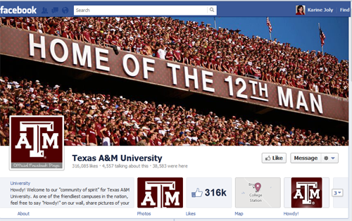
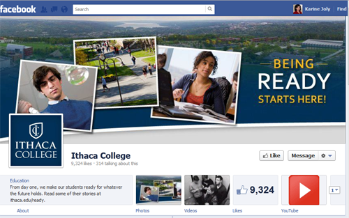
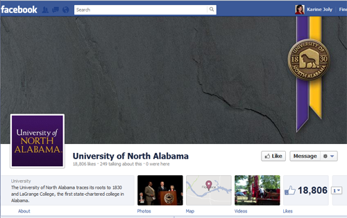
As you’ll see there are different approaches for the cover image of the new Facebook Timeline Page: campus scenery, winning sport team, emblematic monument, designed branding banner look including some calls to action or important info (I like Medaille College’s take: when you look at it on a desktop screen you can actually see your own face reflecting in there)
Here’s the resulting sample of 15 higher ed Facebook Timeline Pages (Yours not there? Add its link in the comments below!) in no particular order:
And, in case you want a bird view of all these Facebook Timeline Pages, here it is:
Please add your own Timeline Page by posting a comment below!




Ours is a domestic study-away program at the University of Hawai‘i at Manoa called “A Semester in Hawai‘i”: https://www.facebook.com/SemesterInHawaii. Why don’t you come visit and give us some pointers in person!