FACT: Web redesign projects don’t have to mean a hefty budget after 18 months of committee meetings.
Last Spring I wrote about Juniata College’s 1-month no-committee redesign and that post got a lot of attention. So, when Amy Filardo, Director of Web Communications at Loyola University Maryland, emailed me, a few weeks ago, about the in-house website redesign her small team completed over the summer, I was eager to learn more on this agile approach to web redesigns.
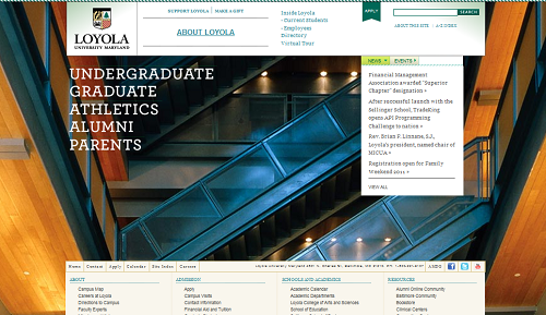
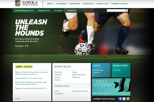
First, let’s have a quick look at the Before and After screenshots:
BEFORE

Amy Filardo, Director of Web Communications at Loyola was kind enough to answer my questions so we can all find out how they did it.
1) Why did you decide to redesign the homepage?
About 2 years ago, Loyola College in Maryland was redesignated and we used this as an opportunity to brand Loyola University Maryland. We worked with an agency and developed a new brand and website at the same time. We took some risks with the new site and, while some of them really paid off, we saw some very consistent issues with navigating the site that needed to be addressed.
2) Can you tell us a bit more about this project?
We decided to make this our major summer project in the Web Communications office (there are 3 1/2 of us – a Web designer, Web editor and content manager who actually left Loyola halfway through the summer, and me). We worked closely with our counterparts in technology services (two developers and two members of the Project management office and a few other resources at key points during the project). We had about 3 months to pull it off from start to finish – and that also included building it in our new content management system so there was some extra development time needed.
We took a very focused approach and only addressed the homepage and a handful of landing pages that needed to be created for the new functional navigation. The biggest complaints we had received on the previous design were poor navigation, important information being buried in the site, and no real feeling of what campus was like on the homepage. We also used analytics data to show what people were trying to get to from the homepage and also what they were using search to find.
After compiling all of this information we began the design and then worked with technology services to build out the site. A few weeks before launch, we sent the site out to the key groups on campus to get buy in and then we sent it out to the entire campus to get their feedback. People were overwhelmingly positive and I think they really appreciated being asked!
There was no budget necessarily allocated for this because we had all of the resources in house but I did end up spending a couple hundred dollars on photography for the 9/11 memorial.
3) Any lessons learned from this redesign you can share with the rest of the community?
The two biggest lessons learned for me were to listen to the consistent criticism to help guide decisions and to open the site up for feedback from everyone!
When we first launch the new site two years ago people were not happy but we knew a lot of that was because the site was dramatically different from what people were used to seeing. We not only changed the design but, at the same time, we launched a portal for current students, faculty and staff, so the site was no longer for them and that change was hard for people. But the comments we were still getting a year later were the ones that were clearly major issues and not just preference and those were the things we were able to address in the redesign.
Second, in the last redesign there was not enough time built into the project plan to gather feedback broadly. And, even if we had, we wouldn’t have had enough time to make any significant changes! This time, since we were just focusing on the homepage, we made sure that we had time to show the campus community and we actually posted the site all over our social media outlets so that it went beyond just the campus. We got comments from alumni and prospective students that we wouldn’t have gotten had we not done that and it really gave us the confidence in what we were doing.
Since the site has gone live we have gotten very few complaints and most people have said that this is a much better representation of Loyola. Next up, the interior pages!


Congratulations to Amy and the rest of the Loyola team! The content organization of the new homepage makes a lot of sense and looks very fresh.
Can’t wait to see what they do on the calendar-side of things! :)
Mykel