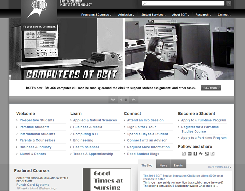
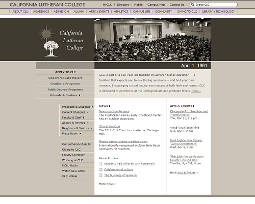
April’s Fool Day is upon us and up until now I’ve been really impressed by the creativity put into a few higher ed web redesigns.
This year, some web teams have been given A LOT of liberty to do amazing and funny homepage redesigns.
Thinking about it, wouldn’t it be nice if a website redesign could be done this way, letting Web professionals do what is best for the end users and leaving the internal politics (or the institutional myopia in the own words of Jennifer Chesney from the University of Alberta) out of the process?
Maybe, there’s something to learn out of this April’s Fool Day good old fun, but for now enjoy and feel free to post in the comments today’s redesigned homepages I haven’t caught yet in my net. I’ll add screenshots to the post.
BTW, if you’re looking for some guidance for your next redesign, there are still a few seats left for Web Redesign Boot Camp (April 12-14, 2011) presented by Stewart Foss (eduStyle), Matt Herzberger (FIU) and Nick DeNardis (Wayne State U and EDU Checkup).
 Planning or working on the web redesign of your higher ed website? Register for Web Redesign Boot Camp (April 12-14, 2011) to learn what you need to know.


Beloit College’s website is SUPER today. Really. Have a look. (Love those squirrels, Marywood!)
Nice squirrels on http://www.radford.edu as well…
Since we’re wrapping up our 50th anniversary, we threw the home page back in time (http://www.callutheran.edu). CLU used to be CLC. More of an inside joke. I’m loving what everyone else is doing.
We went with an elephant…. http://www.vassar.edu
And we also have Meryl Streep playing Matthew Vassar, college founder http://vq.vassar.edu
HUGE announcement on the Multnomah University blog today: http://www.multnomah.edu/blog/2012/04/01/a-bold-step-backward/