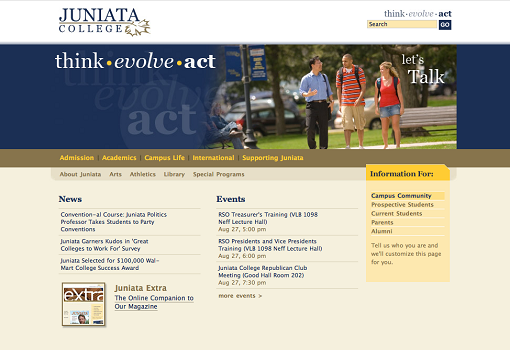
Spring is the season of homepage redesign in higher ed!
After my post about the University of Bath earlier this week, I’d like to highlight today the homepage redesign done at Juniata College (If you’re wondering why I keep writing about Juniata College, wonder no more. They keep pitching me via email their latest projects. You should do it too, you know ;-)
I found this homepage redesign interesting for several reasons, but the feature that really piqued my interest was a new navigation component, revisiting the whole audience-based scheme. Stewart Foss from eduStyle will review many navigation schemes used in higher ed web redesigns during his session at the Web Redesign Boot Camp (April 12 -14, 2011).
BEFORE

AFTER
Personally, this is the first time I’ve seen an audience-based navigation tackled this way. That’s why I asked Rick Stutz, Coordinator of E-Communications at Juniata College, to answer a few questions about this project so we can all learn from his experience.
1) Why did you decide to redesign the homepage?
Our student teams have been pumping out so much cool content for our social media efforts, but it was never featured on the homepage. Nor were all the events and traditions that make Juniata stand out – sure, you could find them elsewhere on the site, if you dug into the Mines of Moria. That had to change.
Analytics already shows that people are finding the content they want with the new redesign. For example, visits to our Spring Open House registration page have been up 17% from just the homepage and the bounce rate down 33%.
Last, but not least of all, the old site was professionally boring – like its job was to be boring – and from 2002.
2) Can you tell us a bit more about the project (timeline, team, resources/budget)?
Conceptualization, design, development, and approval for the redesign spanned the gargantuan timeline of one month. We knew what we wanted to do, and executed it. The team was just me, though I’m sure my student developers were not happy with all the additional work they were pummeled with that month. :) Resources: time. Budget: hah!
It was great to have such a supportive administration behind the work – suggestions were always very minor and approvals took place over the phone or in person, not in committee. And only two professors have complained about the new design.
3) You’ve chosen to do something a bit different with the “who are you” feature. How did you come up with this new navigation element?
We used to have multiple homepages for our various audiences; it was cumbersome and didn’t allow for much overlap with content (e.g. both alumni and current students would love to watch our live stream of the Bailey Oratorical, our yearly student speech competition). We wanted to get snazzy content in front of our audiences’ faces without a bunch of pageloads and annoyance, and more importantly we wanted them to be able to find what they were looking for, and quickly. Also, jQuery is sexy.
4) Any lessons learned from this redesign you can share with the rest of the community?
Allow analytics to fuel your navigational decisions. Be a hardened samurai and don’t give in. If a campaign, link, or event doesn’t appeal to more than 50% of your userbase, it doesn’t belong on your homepage. Secondly, even if you’ve created an amazingly elegant set of css bits that’s accessible, you’re going to be in pain trying to make it propagate to your 10,000+ webpages – move your page elements around with jQuery.
Also, if you’re reading this interview and have already validated the page (like I’d do for your design) and you can figure out how to make the issuu embeds validate, I’d love to hear from you. :)
 Planning or working on the web redesign of your higher ed website? Register for Web Redesign Boot Camp (April 12-14, 2011) to learn what you need to know.


The embed element isn’t valid HTML 4.0 or XHTML 1.0 – it’s a browser-specific fallback that you shouldn’t need any more.
I’d just remove the embed elements and test the page in your targeted browsers. If it still works, validation is yours!
Phil – Cutting out the and adding in “type” and “data” to the did the trick! Thank you kindly sir.
[…] A 1-month no-committee web redesign for Juniata College Homepage #highered | collegewebeditor.com New post: College Web Editor – A 1-month no-committee web redesign for Juniata College Homepage #highered http://bit.ly/eGaBQd – bloghighed (bloghighed) http://twitter.com/bloghighed/status/50891262345224192 (tags: highered via:packrati.us) […]
Love the new look and the concept of the “who are you” box, but… what does it do? In Chrome and FF4 nothing changes except an anchor address appears in the URL, and IE8 throws a “pageTracker is undefined” error. Have I just hit the site at maintenance time, or is there a piece of this not yet hooked up?
Mike – you caught the site in the 5-minute window when I was updating GA to the new asynchronous tracking code. :) Give it another try!
OK, now I *really* love it.