While you were wrapping your holiday presents and baking your cookies, I finally got a few hours to set up a new theme for my beloved blog.
I’ve chosen a design that is reader-friendly (pretty good idea, isn’t it?), clean and light: BigFeature. Mike Richwalsky used this theme for JCU Magazine – and as soon as I saw it I fell in love.
I also added a few options that were missing in action since the last redesign:
- AddThis button so you can share your favorite posts on Twitter, Facebook, via email or with other services.
- Related posts so you might find something interesting about your topic of interest written in the past 2 years.
- More visibility for the comments so you can jump in the discussion easily
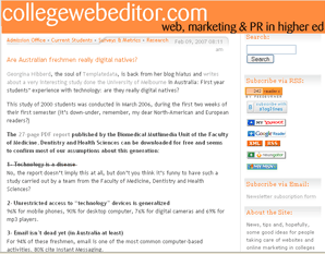
If you’re not reading these lines on the blog, here’s a screen shot of the new design.
Can you believe it? It’s the fourth design for collegewebeditor.com.
Since Dec 2010
Feb 2009 – Dec 2010
Feb 2007 – Feb 2009
Feb 2005 – Feb 2007

Like it? Hate it?
Let us know by posting a comment!


