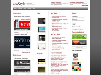
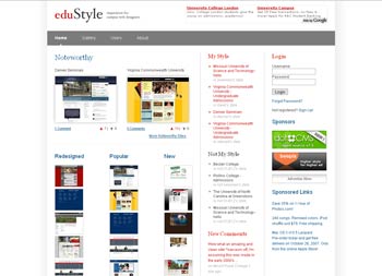
Benchmarking is the name of the game in higher education. No matter the type of projects you plan to work on, you (or your boss) will always need to see what’s done in others institutions.
Website (re)designs are no exception to this rule, and that’s why eduStyle, the website that aims to provide inspiration for campus web designers has become such a great resource for anybody involved in higher ed web design.
I had the pleasure to meet the man behind eduStyle, Stewart Foss, at HighEdWebDev in Rochester earlier this month. Manager of Web Services at Grant MacEwan College, Stewart was working at that time on the redesign of eduStyle, a redesign he launched a few days ago. So, it was the perfect timing for an interview.
1) When did you launch EduStyle? What was your goal at the time?
Sometime back in 2005 I began printing screenshots of college and university websites that I liked and posting them to the side of a bookshelf next to my cubicle under the label “Sites that don’t totally suck” (because every site has a little bit of suckiness – we all have a rogue department using a 1996 design). Every few weeks someone from my 3 person web team would print out a site that they liked and stick it to the bookshelf. The major problem that drove me crazy was that there was no easy way to find the good ones. I would often scroll down the listings of schools randomly clicking and hoping that one would catch my attention.
It was not very effective, so it didn’t take long to realize that it was time to have a higher-ed focused web design gallery. I started to get serious about the idea in the late summer of 2006. To be honest I wasn’t sure how many good websites would come through the door, so to test the waters I sent out a request for submission to uwebd and received well over 50 in the first hour. Based on that I decided to go for it. My main goal was to build a community of people who could share high quality examples of higher-ed web design. I also wanted an easy way to track redesigns and popular trends. It took a few months of evenings and weekend work on the site to pull it all together. The site went live on January 24, 2007.
BEFORE

AFTER

2) How many registered members does the website have?
As I write this the site has 471 registered members. The total number of users and top users are listed on the users page of the site.
3) With your website, you get a chance to review the latest redesigned websites and monitor the design preferences of the higher ed web professionals. What are the main current trends in higher ed web design?
The vast majority of the sites that come in are built up using 3 horizontal stripes of content. The top stripe is generally filled with the branding and the universal site navigation (quicklinks, search box, portal link, etc.). The second strip is the visual piece. It contains the “featured content” and the primary site navigation. The third stripe is the primary content area. This is usually divided into at least 3 columns which include welcome text, news, events, more featured content, or additional navigation. There are several examples of this style of site:
- Cornell University
- Biola University
- Biola University Undergrad Admissions
- Notre Dame
- University of Miami – College of Arts and Sciences
- Ball State
The other interesting trend to watch is the sliding doors of content. You can see this style on the following sites:
I am starting to find more sites that break out of the 800×600 box and more and more are using flash and video content more liberally. I am also glad to say I am seeing lots of sites that are not afraid to use colors other than the school colors. And, of course, AJAX.


In order to determine whether an interface design is successful, one should know the target audience, the desired messages, and the principles that drove the design process. Otherwise, there’s no way to evaluate a design, other than personal opinion.
For instance, a site for elder alumni may successfully engage that audience, whereas teens might not be so engaged. For that matter, the successful product design for ballroom dancing shoes would probably be different than for snowboards.
Stewart, have you considered asking for a creative brief or strategic background from designers who submit their work to edustyle?
That’s a great point, Jay.
Something that would make eduStyle even more useful.