Yesterday I posted a screenshot of the homepage of the university website when I heard the news — only early in the afternoon as I was working on deadlines far away from any news sources.
This morning I was able to retrieve an early version time stamped at 9:58 AM from Google’s cache.
I’ll try to post more screenshots in this post as they become available, thus trying to provide a record that could help study how this terrible tragedy was handled on the website.
April 16 – 9:58 AM (Google cache – the announcement – on the black background – reads “Emergency. Gunman on Campus, Stay Indoors and Away from Windows. See details.”
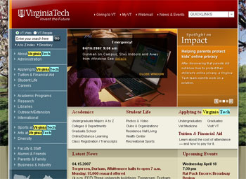
April 16 – 12:40 PM
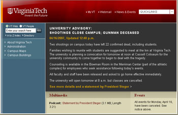
April 16 – 4:45 PM (sent by reader Lori Parker)
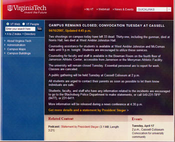
April 16 – 10:00 PM
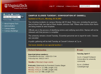
April 17 – 9:30 AM (Gunman identified by name)
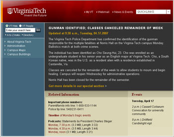
April 17 – 3:25 PM (timestamped from the news section – the quote is from VT president and reads: “I want to extend my deepest, sincerest, and most profound sympathies to the families of these victims …”
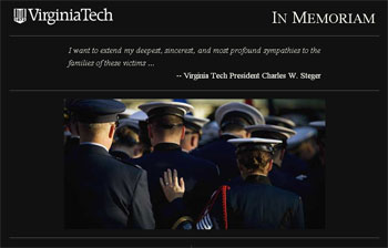
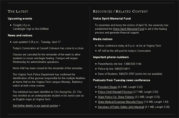
April 19 – 9:40 AM (timestamped from the news section – the right column titled “We Remember” lists the names of the victims whose families have been notified at this time)
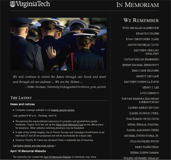
April 23 – 7:45 AM (Classes resume at VT)
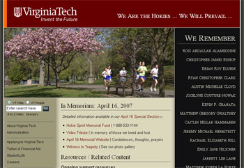
Here’s the event timeline provided by Virginia Tech.


The one thing that this event has highlighted is the need to have a “light” version of a home page or some method to redirect it. As the web has become so critical in delivering important content like this we have to make sure we can guarantee the availability of the service. As much as the content of the message matters being able to keep it up so anyone can see it is just as important. A slim, simple HTML page plus proper load balancing to scale up in times of emergency needs to be a critical part of any communication plan.
Thank you for this post. Here at Rochester, we do have a “light” HTML page in our back pocket for emergencies, as Dave O. suggests. However, my concern is that I don’t know who knows about it besides me, and how the decision would be made to implement it.
Like many universities I’m sure, we’re meeting in the next days to discuss our crisis communications plan, and the importance of the homepage (particularly for external audiences, I think) will be one key topic, I’m sure.
We had a light HTML page, but this made me realize how much more we had to think it through.
For one thing, people are going to want certain things in a crisis: phone numbers of loved ones, perhaps directions to the college, and who knows what else. One thing I think we will do with our light page is gather those resources for a crisis sidebar, comment them out, and then when the time comes we can quickly uncomment any that are appropriate to the situation, without having to brainstorm in a crisis and then hunt the links down.
A second point: there’s a lot of things one might forget. The V. Tech page shows the time of the last update. That’s good and hopefully we’d remember to do that, but it’s something you could overlook in getting up a page fast. So I think we’re going to kind of template that in to our light page, so that we don’t forget it if the time comes.
A third point: I hadn’t really thought out what level of continuity one might need AFTER the emergency, but before things were back to normal. A graphical break from the normal look might be appropriate during the emergency, but in the immediate aftermath, having the site have some continuity with the usual site provides comfort. The Virginia Tech page does that while keeping it’s gravitas. We need to do something similar.
We’re going to make some decisions on our lite page in the next week or so, hone what resources we might need on it, and how the template should look. But thanks for this post, it’s a good starting point.
[…] Tech, c’est au tour du Northern Illinois University de vivre une fusillade. Durant sa crise, Virginia Tech avait modifié la page d’accueil de son site web et on dirait que la Northern Illinois University s’en est […]
[…] Karine Joly documents on CollegeWebEditor.com, Virginia Tech ended up using a series of crisis pages and templates they used throughout the […]