The State of the Mobile & Responsive Web in Higher Ed Survey
As I explained in my post about mobile and web traffic increasing shares on university and college websites last week, the analysis of the survey results on the 2013 State of Web and Responsive Web in Higher Ed is now completed.
The 12-page report of the 3rd edition of this yearly survey (n=174) will be published on Wednesday, but I’ve decided to share a couple of insights before its official release in an attempt to increase the reach of these important findings.
Mobile has reached a tipping point in higher education
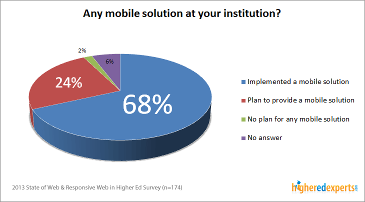
68% of the surveyed institutions have already implemented a mobile solution (mobile website, responsive website, native app, etc.) targeting and serving owners of mobile and other connected devices.
This represents a 10-point increase in a year. And, this proportion has almost doubled since 2011 when only 37% of the surveyed institutions had already implemented a mobile solution.
Responsive websites now the most popular mobile solution in higher ed
What do institutions use as their mobile solutions? More and more have chosen to go responsive!
- 51% of the surveyed institutions have already adopted the responsive web design approach.
- Last year, only 15% mentioned using responsive techniques.
- 45% use a dedicated mobile solution(s)/framework designed and developed for mobile users only and supporting a family of mobile devices.


Looking for real solutions to challenges with responsive web design?
Higher ed Responsive Websites Summit
Expert solutions, lessons learned and content strategy roadmap to go responsive in higher education
higheredexperts.com/rwdsummit


