 If you are somehow a regular reader of this blog (collegewebeditor.com in case you’re reading this in your RSS Reader or on another aggregator ;0), you know that I’ve become a strong proponent of the responsive web design approach for higher education over the past year.
I know, I know: if I’m such a strong advocate, how comes this blog and the Higher Ed Experts website aren’t responsive yet? You know the saying about the shoemaker, right?
Well, we’re slowly getting there as I’m currently reviewing a complete fresh set of wireframes at 3 different screen resolutions for our future responsive websites, wireframes that were submitted for review just last Friday :-)
If you need more reasons “to sell” the RWD approach to your stakeholders or decision-makers, you should take the time to read the very interesting study report released by Google Research just a few days ago: The New Multi-screen World: Understanding Cross-Platform Consumer Behavior (PDF).
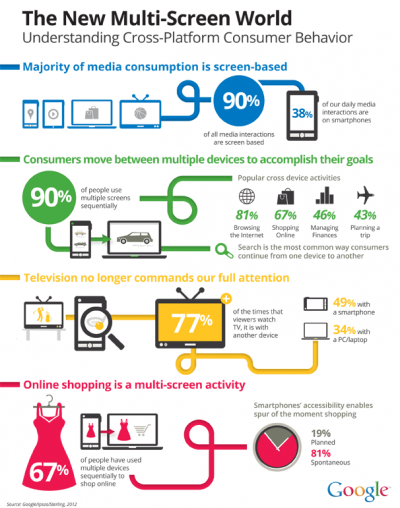
This 46-page report was designed like a collection of infographics. And, I even found the single infographics above highlighting some findings.
There’s been a series of posts presenting the main findings of this report (on Google Mobile Ads blog, TechCrunch, etc.), so I’ve chosen to focus on only the 2 points that are relevant to responsive web design and higher education:
REASON #1: 90% use multiple screens sequentially
Design Responsive Experiences for Mobile+PC or Mobile+Tablet Browsing
They start browsing a website on a device (most of the time their mobile phone), then they switch devices and keep browsing on another (most of the time a PC). This behavior observed throughout the Google study occurs on the same day in 98% of the cases. This finding has big implications for higher ed folks designing web or mobile presence for their institution.
It can also help understand a surprising finding from the 2012 Mobile Browsing Behavior and Expectations of College-Bound High School Seniors report by Noel-Levitz: 52% of respondents have looked at a college website on a mobile device. What the Google study shows is that the admissions game is probably NOT moving exclusively to mobile, but that your mobile site is becoming the first thing prospective students look at.
So, while making sure your (admissions) website does its job when viewed on a mobile device is important, it should NOT be seen as the only important piece of the digital experience your provide to your prospects or other target audiences. People move to different devices because they want to accomplish different things and they prefer to use the device that better fits the specific need they’re trying to fulfill at a given moment. This is the reason why the responsive approach whether it is applied to design or to content makes so much sense as it lets institutions customize the experience for the device used at a specific point in the “conversation” between the user and your institutional digital presence.
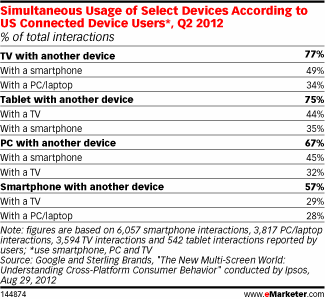
REASON #2: When people watch TV they also use another device 77% of the time
If you do TV, design digital experiences that work on Mobile, PC & Tablet
According to the Google study, most people also use multiple screens – including TV – at the same time.
This has huge implications for your institution if you do any TV advertising, pitch stories to TV news or have a team the games of which are broadcast on TV.
Whether your message is very specific or your TV ads are all about branding, including a call to action with a web address is a must.

However, given the diversity of the devices used while watching TV (mobile phones, PCs or tablets), it is crucial that your digital presence looks good on ANY of these devices.
Once again, especially when you don’t have a very specific call-to-action like “apply” or “donate,” it is better to make sure your users will be able to use MOST of the pages on your site.
In this case again, a responsive approach applied to the design and the content seems the best solution.
What do you think?
Can anybody share a concrete example where this has proven to be true (or not ;-)?
 4-week online course: Mobile & Responsive Web Design for Higher Ed
(asynchronous with weekly lessons and assignments)
Only 10 seats per session


I think you’ve got two reasons why it’s important to consider multiple screen sizes/types, but neither connects as an explanation of why responsive is the solution.
Reason #1 is actually an argument -against- responsive. If people are using the same tool across multiple devices for the same task, it is disorienting for the tool to display differently on different devices. That’s a usability problem caused by responsive design as a solution.
Reason #2, again, emphasizes the importance of compatibility across many devices, but doesn’t explain why responsive is the best solution.
The most important part of the discussion surrounding responsive, I think, is to understand why it’s unresolved and probably always will be: different devices warrant different designs, but different designs present usability problems. (You can see, this is the problem that your reason #1 runs into.) I don’t think there’s any way around that fundamental conflict, which means responsive design can never be the ultimate solution. It will always need to be decided on a case by case basis.
Dave,
Thanks for your comment.
Reason #1: Why would it be disorienting? The responsive approach offers an experience that is customized to the device possibilities and limitations – not a totally different site as it’s often the case with mobile sites.
Reason #2: in this case, responsive is not as much important for the end user as it is a manageable approach for higher ed web developer. I don’t know if you work for a university or college, but institutions usually can’t invest a lot of money (or bodies) maintaining several different versions of a website.
Again, responsive doesn’t have to mean totally different designs – more like smart adaptation to each device’s possibilities and limitations as I wrote above.