How do you like your site?
Web? Mobile? How about Responsive?
As my cutting-edge technically-oriented readers already know (but I love you the same even if you don’t yet ;0), Responsive Web Design wasn’t exactly born yesterday. The term was coined in an article written by Ethan Marcotte and published in May 2010 on A List Apart.
While Marcotte, the de-facto Founding Father of the Responsive Web Design approach (and its biggest evangelist), has already written a book about it, RWD still doesn’t have an article of its own in Wikipedia where the only reference I found about it was this very short definition: “a methodology for designing web sites that can adapt to a range of screen sizes and device types.”
So, it’s no suprise that RWD examples in higher education don’t abound – yet – even though this approach of designing once for all devices (desktops, large screens, tablets and mobile phones) might be the most efficient way to maintain and futureproof higher ed websites.
A few weeks ago I asked the + 2,500 readers of my weekly email newsletter if any were working or had launched a higher ed website based on a the Responsive Web Design approach.
And, I can say that the higher ed community wasn’t very responsive (sorry couldn’t help myself) as I only got back a handful of emails…
I’m currently working on my next article for University Business about this topic and have already interviewed most of these trailblazers. So, watch for these interviews as I plan to post them on this blog in the coming weeks.
Anyway, I hope this will help institutions who need it get up to speed with this approach as the students of this course will not only become fluent in RWD but will convert a traditional web page of their choice into a responsive one in just 4 weeks.
In the meantime, since a picture is worth a thousand words, here’s a showcase of the higher ed RWD websites I was able to find (if you want any to be added to this list, please post a comment below with the web address and I’ll add them to the post).
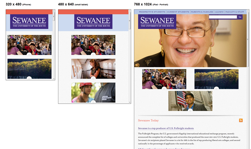
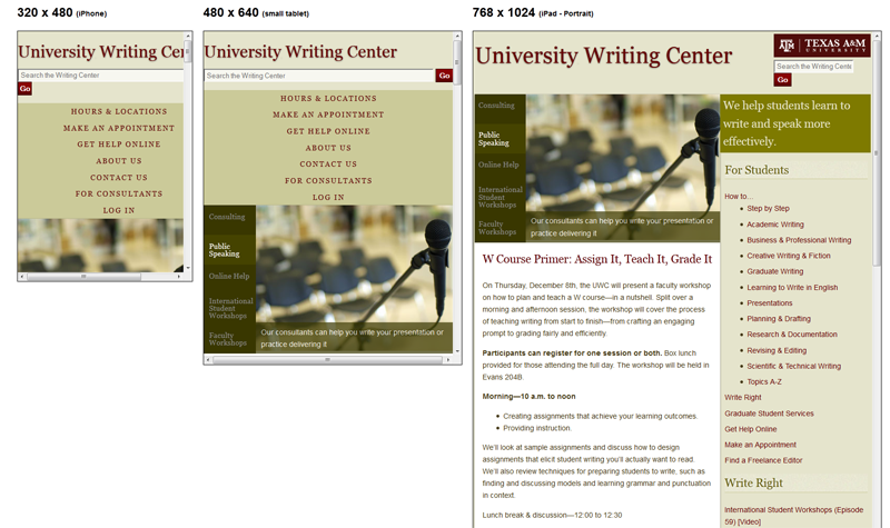
Disclaimer: the screenshots have been done at different screen sizes. However, it’s important to note that many mobile web browsers will try to resize/scale down a website so it fits neatly within the device screen. In the RWD approach, this feature is usually desactivated to offer an optimized user experience designed with a purpose. That’s the reason why these screenshots might be slightly different from what you’d get if you visit these websites with an iPhone or an iPad.
Economic Development – University of Missouri
95 Scenes of Gillman Hall (John Hopkins University)
Texas A&M University – Writing Center
The EbbTide, SCC Student News Magazine
(asynchronous with weekly lessons and assignments)
ONLY 10 seats per session