‘Tis the “caps and gowns” season on higher ed websites
Whether your school still uses a carousel, a big hero photo or even a huge background photo, chances are your web homepage will show some caps and gowns this month.
Graduation ceremonies are such an important part of campus life for graduates and their family, but also for younger students and older alums.
I’m sure you’ve all heard or seen how pictures featuring people are best suited to capture attention and trigger strong emotions on social media and elsewhere on the Web.
That’s why I was a bit surprised when I stumbled upon the current homepage of the University of South Carolina a few days ago after a tweet with a link – but no photo – caught my attention.
Below is a screenshot of this university homepage.
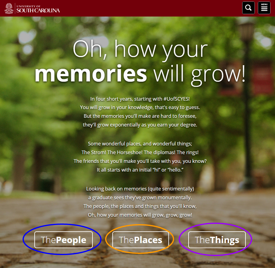
All text on an artistically blurred background photo with 3 links at the bottom (I added the color circles so you can see them right away) reading The People, The Places and The Things.
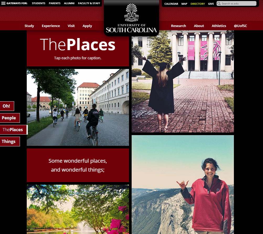
Only when you click on these links do you get to see photos — but an avalanche of pictures crowdsourced via social media and selected by the team behind this project.
It’s like opening a present for your eyes after this nice – yet very texty – homepage.


The story behind a bold(er) website homepage for the University of South Carolina
Bold, don’t you think?
I do.
 I was so intrigued that I asked Amy Grace Wells, Content Strategist at the University of South Carolina to answer a few questions via email to help us all understand this approach.
1) You’ve taken a bold move with your homepage — focusing on an inspiring text that leads to photo galleries. Can you explain what guided this choice?
Since relaunching the site in September of 2013, the University of South Carolina has presented a series of interactive homepages so the current one is by no means the first bold choice we’ve made.
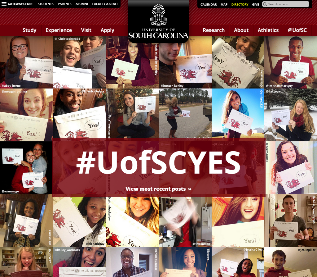
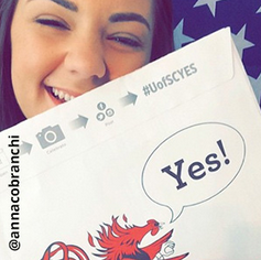
As an example earlier this year, we presented an interactive display of accepted students with their #UofSCYES envelopes that led to a bigger social media gallery.
Research led us to focus our homepages around a singular message targeting prospectives, predominantly prospective students and parents rather than the more common “newspaper†approach to university homepages.
For the graduation homepage specifically, we wanted to show prospective students and their parents the UofSC experience through the eyes of our graduating seniors. We didn’t want to lead the conversation but open it up and allow them to share those moments that meant the most to them. Based on the initial response we found the people, places and things themes, which led to the development of the three galleries.
Since we’ve already set the precedent for bold, interactive homepage designs and launch new homepages every six to eight weeks, there was very little to “sell.â€
Our homepage designs are strongly tied to our university brand and our team has strong support to tell those brand stories in unique and interesting ways through a variety of university voices.
2) So far, what kind of feedback did you receive from the campus community?
Our graduating seniors are thrilled of course. We immediately started to see a stream of positive mentions on social media, from them and others in the university community.
It has resonated well with alumni, who are nostalgic and remember their own memories for these key student experiences.
We’ve even seen a response from our incoming freshman for next fall as they express their excitement and wishes for the summer to pass faster!
3) Has this move had an impact on the bounce rate of your homepage?
Our analytics showed that the gallery buttons on the opening page received nearly 1,000 clicks within the first day (Note from Karine: out of 60K unique visitors that day).
We continue to see submissions through social media on the hashtag #UofSC15 and even have our social audience posting screenshots of the opening text.
As far as bounce rate, with our history of interactive homepages, it’s difficult to tell, but there has been no significant change. In fact, since launching this design the average time spent on the homepage is 3:26, where our average time is 2:11.
Interactive university homepages?
While Amy made it clear that the team has been creating bold homepages for almost a couple of years, I still think the all text homepage is somehow bolder.
It really creates a cognitive dissonance for anybody used to browsing higher ed websites (or any websites) where big visuals are expected.
And, I’m so glad it did, because without it I would have never dug deeper and found out about UofSC “interactive homepages” as Amy calls them.
By designing integrated content-focused homepages, the team has managed to get its community excited again about the website homepage while featuring front and center content produced by current students (for the graduation homepage) or prospective students (for the “admitted” homepage – BTW, have you noticed the amazing envelope of the acceptance letter? So smart).
The whole approach is pure gold on so many levels: community engagement, social media reach, website visits and even SEO by the increased numbers of links to the homepage from the social media accounts of the people won over by a given instance and pointing to the homepage.
Got a bolder or more innovative homepage?
I want to see it. Send me a note via email at karine@higheredexperts.com.
I’m looking for other examples of a different approach to the higher ed homepage or website.
Lately, it seems to me that most higher ed websites look similar, but I’d love you to prove me wrong.


College Web Editor – A different take on the #highered website: @UofSC interactive homepages: ‘Tis the “caps a… http://t.co/yGvTwewdV5
@dombillington A different take on the #highered website: @UofSC interactive homepages | http://t.co/Zm1db2Hm7u http://t.co/yhaKyde9Yg
A different take on the #highered website: @UofSC interactive homepages | http://t.co/ck89IaD6Jj http://t.co/CGYkEDjd59
I’m just a part of an amazing team here @UofSC that is rethinking the #highered homepage. http://t.co/MRhUc4OEYS
Thanks for noticing! –> A different take on the #highered website: @UofSC homepage via http://t.co/dMRGSLw8mO http://t.co/9BRGUrXXEe
A different take on the #highered website: @UofSC interactive homepages http://t.co/UuvBHrWCvW
From the US: the story behind a bold(er) web homepage for the University of South Carolina @UofSC
http://t.co/7m9arIPOOp (via @karinejoly)
The bold interactive university homepages of @UofSC – trend setters? http://t.co/zMZnquXCgj http://t.co/HmpymwKTFQ
A different take on the #highered website: @UofSC interactive homepages http://t.co/2JI7CbwaFG #hesm #confabedu http://t.co/xto2twM5cy
RT @higheredexperts: A different take on the #highered website: @UofSC interactive homepages http://t.co/2JI7CbwaFG #hesm #confabedu http:/…
A different take on the #highered website: @UofSC interactive homepages | http://t.co/ci8O8uZgBW https://t.co/Zv1WkgQMZG
“A different take on the #highered website: @UofSC interactive homepages”
http://t.co/pWi7J5Uor4 (via @karinejoly) http://t.co/gi878eFmED
+1 RT @Jisc: “A different take on the #highered website: @UofSC interactive homepages” http://t.co/p1X5DpyPuL http://t.co/ySCLDFhWxh
RT @Jisc: “A different take on the #highered website: @UofSC interactive homepages”
http://t.co/pWi7J5Uor4 (via @karinejoly) http://t.co/…
@sara_day I blogged about a great example today: http://t.co/dj2IDp3Drb #casesmc #hesm
A different take on the #highered website: @UofSC interactive homepages | http://t.co/x7LqsLNcje http://t.co/ZDFTWpJhzO
A different take on the #highered website: @UofSC interactive homepages | http://t.co/tos1K3SsY0 http://t.co/1K5vdTRSzF
Very cool website design from @UofSC. Interactive home pages. via @karinejoly http://t.co/2lWZE22SGc #hesm
“A different take on the #highered website: @UofSC interactive homepages” http://t.co/TAk6fRkDqm
A different take on the #highered website: @UofSC interactive homepages | http://t.co/rogHzdZYD0 http://t.co/jxtzsr23j8
A different take on the #HigherEd website: @UofSC interactive homepages! http://t.co/Dnefd65dby http://t.co/2jyVYQvw2H
RT @jchuggins: Thanks for noticing! –> A different take on the #highered website: @UofSC homepage via http://t.co/dMRGSLw8mO http://t.co/9…
RT @SimpScar: A different take on the #highered website: @UofSC interactive homepages http://t.co/9H6UFGVWpb
RT @SimpScar: A different take on the #highered website: @UofSC interactive homepages http://t.co/9H6UFGVWpb
Nice work, @amygracewells and team! Love the @UofSC interactive homepages | http://t.co/FyxUktVpUN by @karinejoly #highered
First of many. Lucky to be apart of the @UofSC team. http://t.co/seFtMJEPRY #highered http://t.co/e9eAEeY91a
A different take on the #highered website: http://t.co/ECx5ohLbuE http://t.co/k2pheEIQJd
RT @bloghighed: New post: College Web Editor – A different take on the #highered website: @UofSC interactive homepages http://t.co/0hSozxIy…
RT @karinejoly: A different take on the #highered website: @UofSC interactive homepages http://t.co/185q7ihLLJ #casesmc #heweb15 http://t.c…
A different take on the #highered website: @UofSC interactive homepages | http://t.co/jTBwzrXGcA http://t.co/26aK8wiT8q