The University of Vermont launched its redesigned responsive website a couple of weeks ago.
 Tatjana Salcedo was among the first higher ed professionals to take the 4-week online course on responsive web design taught by eduStyle Founder, Stewart Foss..
I’m always excited to learn about new RWD sites in higher ed, but it’s even more exciting when one of our alums does really great work (school pride, I guess ;-).
That’s why I asked Tatjana a few questions about the project so we can all learn from her experience.
1) Can you tell us a bit about your responsive redesign?
We published our first official mobile site (m.uvm.edu) on the Kurogo framework in the summer of 2011. The site featured a selection of popular syndicated content including news, calendar, course, video and map information. Almost immediately interest in including non-syndicated content emerged. Although we began to incorporate key chunks of HTML content from our “regular” site on the mobile site, we knew that a more comprehensive mobile strategy was going to be needed for a longer term. I had been following the Boston Globe responsive redesign and was very impressed by the responsive web design approach.
The institution’s web team has long been hampered by an antiquated infrastructure. Our home-grown web publishing system — or CMS-lite, as I like to call it — has been set for replacement since 2005 but the needed resources haven’t been allocated to upgrade. However, if there is one thing that the old system handles well, it’s templates. Responsive design seemed attainable within our limited means. I was able to generate some compelling reports on the rapid increase in mobile web traffic, particularly in the area of admissions and prospective students, to convince my team and several key administrators that a responsive “redesign” would be a worthwhile project.
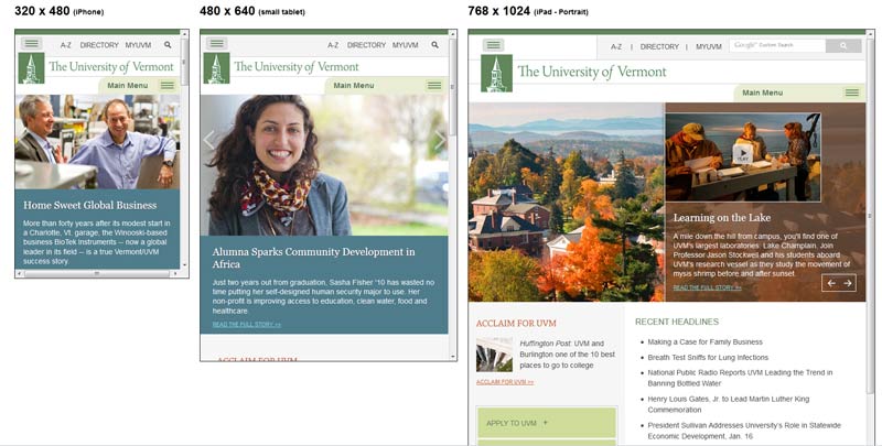
To keep the project manageable, we decided to redesign using our existing content and visual design with only minor modifications. Additionally, we opted to take a mobile-first approach with the intent being to optimize performance to those accessing the site from mobile phones. We got a late start, due to some intervening priorities, but in the fall of 2012, we were off and running developing our responsive templates.
2) What was the biggest challenge you encountered while developing this responsive website?
Our biggest challenge has probably come in the wake of our responsive launch.
Minor design adjustments and new layouts on mobile screens has lead to renewed scrutiny of content and dug up old and new political bids for homepage and banner real estate. Additionally, it has become an even greater challenge to articulate content and visual design best practices and choices made to accommodate a wide range of resolution and touch screen capability.
Hopefully, it will be a small price to pay for being on the leading edge of the higher ed responsive wave.
3) What piece of advice would you give people about to start a responsive web redesign?
If I were to do it again, I would definitely try to use a responsive grid framework.
The combination of choosing a mobile-first approach and working with an existing design made that impractical for us this time, but this seems to be an aspect of response design that is rapidly progressing and we’ll definitely want to try it when we next update our responsive templates.
4) How has the course on responsive web design for higher ed helped you with this project?
We were very fortunate that two of us on the web team were able to take Stewart’s online responsive web design course, myself and Megan Hack. It was a great theoretical and technical foundation for our project and certainly gave us much needed additional insight into responsive design specifically within the higher education sphere.


