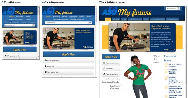
Angelo State University has chosen to go responsive for prospective students first.
The institution launched a brand new site based on the responsive web design approach to offer them a better web experience – no matter the device they use when they visit the site. An in-house team, including Jon Wilcox, Web Development Specialist at Angelo State University, worked on the project.
Jon Wilcox was among the first higher ed professionals to take the 4-week online course on responsive web design taught by eduStyle Founder, Stewart Foss. Jon received the certificate in responsive web design for higher ed – only granted by Higher Ed Experts to the students earning a final grade of 80% or more – in April 2012.
 I’m always excited to learn about new RWD sites in higher ed, but it’s even more exciting when one of our Higher Ed Experts alums does really great work (school pride, I guess ;-).
That’s why I asked Jon a few questions about the project so we can all learn from his experience.
1) You launched your new responsive website targeted to prospective students in August 2012. Can you tell us a bit about this project?
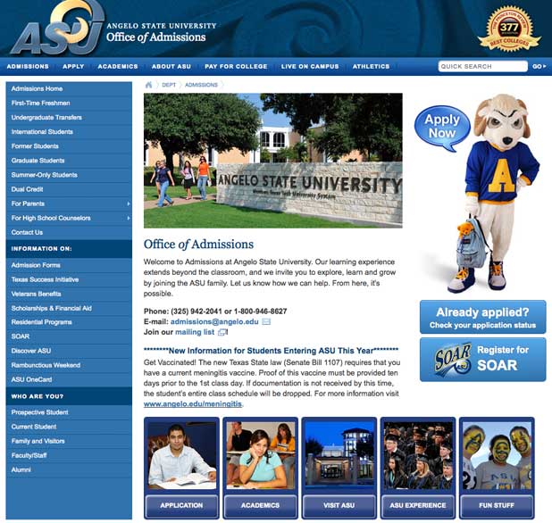
We created myfuture.angelo.edu to replace our old Admissions site. Our old site was very static and link heavy, and we felt like we needed something more dynamic and exciting for prospective students.

We have been talking about the idea of a prospective students microsite for years, and we finally began the actual planning process in February. Our team was very small, consisting of the Director of Admissions, a web writer, a graphic designer, and myself, web developer.
After some initial discussions to determine our project goals, information architecture, and main calls-to-action, we got started. Our graphic designer worked on wireframes and mockups and then I began to build some templates. Because one of our goals from the beginning was to make the site responsive, I chose to use the Bootstrap framework. It’s a great framework for getting started on a site quickly, and it is responsive “out-of-the-box”.
Throughout the summer, our writer continued to provide content, while I built pages. About 6 months from our initial meetings, we launched the site on August 2.
2) What was the biggest challenge you encountered while developing this responsive website? How did you overcome it?
The site came together rather easily. There were no considerable challenges that I can remember. Because we started with a responsive framework to begin with, a lot of the hard work was already done. And since this site was essentially a blank slate, we didn’t have to worry about how legacy content would fit in. Everything was created new so we had the luxury of doing things “right” the first time.
3) You took the 4-week online course on responsive web design for higher ed taught by Stewart Foss in March earlier this year. How has this helped you with this project?
I took the RWD course right as we were starting the initial discussions about this site. It definitely helped a lot in terms of understanding the challenges of designing responsively. Building out this site gave me a chance to get my feet wet and apply a lot of RWD principles on a smaller scale while we prepare to take on the bigger project of applying RWD to our main angelo.edu site.
 4-week online course: Mobile & Responsive Web Design for Higher Ed
(asynchronous with weekly lessons and assignments)
ONLY 10 seats per session


