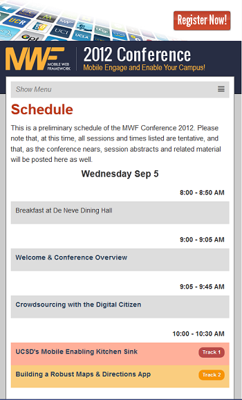
Did you know that there is a higher ed conference focusing exclusively on mobile?
 The 2012 Mobile Web Framework Conference taking place on September 5-7, 2012 at UCLA is the only conference in higher ed focusing exclusively on mobile.
With two tracks on Mobile Engagement and Mobile Development, the conference schedule really looks like a dream-come-true for anybody working on mobile projects in higher education (and that’s probably anybody working at a university or a college by now ;-).
The responsive web design approach will also get plenty of attention at the conference as institutions struggle more and more to tackle our complex world of connected devices.
While you can still register to attend in person the conference (California in September? Kind of nice, no? ;-), it is also possible to attend remotely.
I use the bit of “leverage” I have to get 2 free remote passes (a $145 value each) for you, my dear readers – that’s my way to say thanks for your time and support.
So, how can you get a chance to win one of these free passes?
This is very simple.
- First, you need to work for an institution
- Then, just post in a comment below a link to your favorite higher ed mobile or responsive website (it can be yours or a site from another institution) along with a short sentence explaining what’s special about this website.
I’ll draw the winners among the entries on August 24, 2012 at noon ET. The names will be posted on this blog and I’ll email the winners with the details.
So, what are you waiting for exactly? Tell us about your favorite mobile or RWD website now!
 4-week online course: Mobile & Responsive Web Design for Higher Ed
(asynchronous with weekly lessons and assignments)


We relaunched today.agrilife.org earlier this year with a completely new category/tagging strategy and a mobile/responsive design. It has created more dynamic processes for sorting and featuring the most recent content and enhanced the user experience through more targeted categories. As a land grant, a good percentage of our visitors are looking at our websites out in the field on mobile devices. This has helped make it easier for them to get and share information.
Our sister school, Notre Dame (http://nd.edu/) has, in my opinion, one of the best recruiting oriented responsive sites out there. I see a lot of institutions using mobile/responsive for micro and other smaller sites but ND is one of the few that has successfully deployed a responsive design on their main web presence.
The U of Mississippi mobile website is very good at fitting content to a variety of mobile devices. It provide information useful to people who might be using a mobile divice while on campus. Nice work!
This site does a a great job keeping images largest enough to view, and using great images that flex to mobile size.