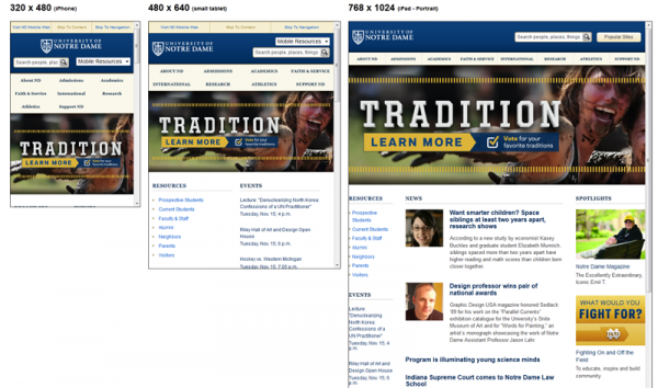
As I explained in the first post on this series about responsive web design in higher education, I interviewed a few early adopters of the responsive web design approach as part of my research for an upcoming column in University Business.
After Stewart Foss, eduStyle Awards founder and the instructor of the 4-week online course on responsive web design for higher education, here’s the interview I conducted with Erik Runyon, Manager of Interactive Development at AgencyND, the inside agency of the University of Notre Dame. His institution launched its redesigned responsive homepage in July 2011, a redesign that got the attention of the higher ed community – and even Ethan Marcotte’s who mentioned Notre Dame when I interviewed him.

1) Why did you choose to adopt the RDW approach? What were you trying to solve?
We’ve been providing mobile styles with our sites for several years now. As time has passed, we’ve been constantly adapting our approach to provide the best possible experience for our mobile users all the while working with limited resources. RWD was the next logical step. With the new ND.edu design that we launched July of this year, we really wanted to focus on improving the experience for mobile and low-bandwidth users. This included improving the design across all screen sizes, eliminating our Flash-based feature area and reducing the download size of the site from over 6 MB to less than 500 kb.
2) Do you think this is a good approach for universities and colleges?
Absolutely. However, RWD shouldn’t be viewed as a magic bullet for addressing small-screen users. Sites should also include media=”handheld” stylesheets for less capable devices, and developers as well as content providers should pay close attention to download size and usability of everything they put into the site.
3) How do you address the importance of context for mobile devices? Do you display only some part of the content on smaller devices?
I believe that making assumptions about context based on device can be a dangerous mindset to adopt. I’ve personally had issues with sites that detect my device, and then proceed to make it difficult, if not impossible, for me to complete the goal I went to the site to accomplish. If we assume we know what a user wants simply because they’re on a mobile device, then we’re ignoring research that shows people are using their mobile devices in many more situations than just “on-the-go”.
It’s much more important to design the content of the site in a way that will make sense when reformatted for smaller screens, all the while allowing our users to easily get to the content they want and need. That being said, I have been known to hide some non-essential elements of a design to improve the usability of a site on small-screen devices, but I intend to do this less in the future.
4) What kind of feedback did you get so far? Did you noticed any major changes traffic-wise?
Response has been great. We’ve received a lot of positive feedback on how great the site looks across a variety of devices. The majority of the feedback has been from tablet users and people who just happened to resize their browser window and notice the layout change. We’ve observed a steady increase in mobile traffic over the past year, both to ND.edu and m.nd.edu. The most noticeable change in mobile traffic with the new design was a spike after initial launch as people were visiting to check out the new design. But since the previous version of ND.edu was mobile friendly as well, this is not unexpected.
5) Any lessons learned you could share with colleagues working at other institutions on RWD projects?
The natural tendency when creating media query break-points is to use the dimensions of popular devices as a strict guide. I’ve found that it makes much more sense to let the design dictate the break-points. While testing the design at different resolutions, find out where it visually makes sense to reformat the content and add break-points at that size. My exception to this rule is that I add additional “mobile” features when I get down to the 480px size. This includes displaying “skip links” and our Mobile Resources drop-down.
 4-week online course: Mobile & Responsive Web Design for Higher Ed
(asynchronous with weekly lessons and assignments)


